Showing posts with label Everyday objects. Show all posts

Wednesday, 19 April 2017

Research log - Everyday objects

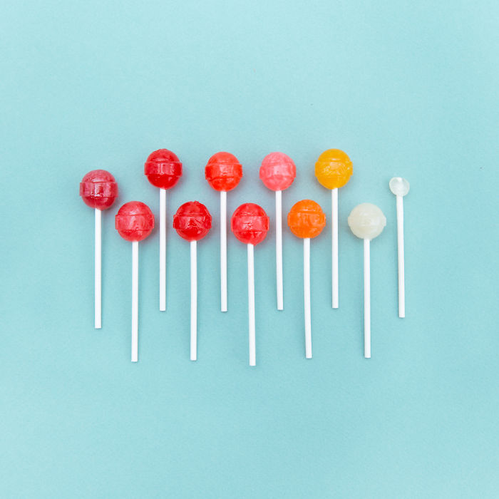
This image is very minimalist and it is of lollipops on a blue background, I like this image because it has the shades of the lollipops going down. It starts off with a very dark red on the left and the right is completely white, I think that the photographer probably did this because it just looks very aesthetic. The photographer used a blue background, this is possibly to make it look like the lollipops are floating.
I also think that the lollipops look like they are getting lighter and the reason for this might be that it looks like it is wearing away and the layers are lighter and lighter underneath.

This photograph is of a piece of cake, I think it is quite interesting because it is an action shot, I think that the photographer must've edited the image as it is not very realistic, although I like the idea behind it a lot. I probably won't use this sort of thing in my shoots as I don't think it would be very good as I don't have a very good knowledge of photoshop.

I like how simplistic this image and how much of a contrast it is, this photograph has a sweet taking place of the actual toothpaste which is interesting because usually toothpaste is used to clean teeth and we wouldn't use something sugary like a sweet to clean our teeth. I like the simplicity of this image, although it has obviously had a lot of thought behind it. It might've taken a while to work out how the toothpaste would fall to recreate it with the sweet.

This photograph is showing the ingredients of a fruit salad separately, I like this because it is very organised, all of the different food is separated out and laid out nicely. I also like how it goes from very colourful, to almost black and white in colour. I think this works well as well because it also goes down in size, the chunks of apple are the biggest and they get smaller until it's the white polka dots which I am not sure what that is.

This photograph is of a person holding a fork with some multicolour spaghetti on it, I can't tell if it is edited on the computer or if it is something like rubber bands that can come in a lot of different colours. I like the creativity behind this, but also how simple it is 

Source
This image is of some monopoly characters, they are very simple but I really like how they have been photographed as you can see the reflection beneath them.


I like this image because it is very creative, the photographer has used sowing utensils to make the shape of a sowing machine. It would've taken a long time to set this image up which shows a lot of dedication and preparation, in addition 

source
This image is by Jim Golden, I really like this image because it has so much repetitiveness. I like how he has laid out the locks and keys so that there is gaps between each thing, whilst there still being a lot of difference between each thing, it isn't the same thing over and over, meaning although it all fits together, it is all different objects. I think this looks good because we can see all the different locks and the differences between them. Most of the keys are very small which means that you don't notice them straight away.

Source
This image is also by Jim Golden, I like this image because it is so nicely laid out, it works because he has used a large amount of the same object, and with this image, you can tell that he has done it in very large scale, some of these cameras are very big but because of how many cameras there, you can't tell the size of them.


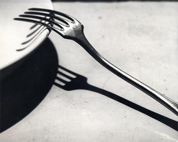
This image is by Andre Kertesz, similar to the cutlery photograph that he took, however it doesn't use shadows. I really like this image because of the way that it is set out, one of the pairs of glasses is leant on the table with its lenses on it, this says to me that whoever's they are, doesn't care about the glasses much because they don't mind them being scratched. It could be portraying his wife and her death, she doesn't need the glasses anymore so they aren't being cared for, or maybe hers are the ones propped up correctly, and his are being scratched, because he doesn't care as much anymore.

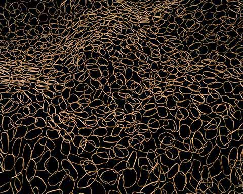
This photograph is of hundreds of rubber bands all over the table, they seem to be almost creating a wave like pattern, rather than just completely flat. This image is interesting because it isn't a normal image of rubber bands, it is quite odd in comparison to a lot of others.
I could use something like this for my shoot, however I don't think I would want to work with rubber bands for my shoot. I would prefer to use something more solid.

This image is very interesting because it looks like a beehive, however it is actually straws, the angle that the photograph has been taken at leads me to think that it looks like a beehive, especially due to the colour of the straws as well. It is quite an abstract piece of work and I really like it because it is very original. I have not seen anyone do something like that before.


This is an image similar to Andre Kertesz, however this one seems to be more thought through and staged, whereas Kertesz image looks very candid and that he took it on the spot. This image was definitely staged as nobody usually puts there forks up like that. However I still really like this image despite this. 

Tuesday, 14 March 2017

Detailed Research - Everyday Objects

Stephen Shore
Stephen Shore is an American photographer that is known for his photographs of banal scenes and objects. He is also known for his use of colour.

This photograph is of a radio in somebodies house, I really like the composition of this image as it looks quite busy, whilst still not looking too filled, I think that the newspapers on the side really help this as they make the image look more homely, it makes the photograph look like it was just found like that rather than having been posed in that position.
In addition to the composition, I really like the colours in this image, it is very pastel, which I really like because it doesn't look too saturated. The only thing contrasting the pastel colours is the newspapers as they are quite a bright white colour. Although, this still works well in the image as the pastel colours would look quite boring without anything to contrast against them.

This image was taken at some sort of restaurant, as we can tell from the credit card on the plate, this image is a lot busier than the last photo, although I still think it looks good, the bottom half of the photo is a lot emptier than the top half, I think that the photographer chose to do this because if the whole photograph was cluttered then it wouldn't look very good.
I like the use of colours in this photo, it is mostly white colours but with slight contrasts like the black tea, and the brown cigar. I like these contrasts as they attract the eye towards them.

I like this image because the colours all fit together really well, the yellowy colours of the food matches very well with the pink colour on the table. Again we still have the bright whites to contrast the pastel colours.
This photograph looks a lot less staged than some of the other photographs because it is quite messy, the edge of the table is in shot which means we can see the floor below, this is quite odd as it makes the photograph look like it was taken quickly, without the photographer thinking about where to pose everything.

This image is of a radio on the wall, the image is composed so that the radio is in the centre of the photo. I like how he uses very faded colours with a black/white contrast for his photographs. Many of the colours are light browns or yellowy tones, and in the centre of the image is a very bright white radio with black details.
I also think it is interesting how he has composed it so that there is a lot of things on one side and only one or two things on the other.

Andre Kertesz
This image by Andre Kertesz is focused heavily on the composition of the image, it looks very simple but uses the shadows in the photograph to make it much more detailed. The light is shining from straight above because the forks shadow is a direct copy of the image, it isn't warped in any way from the direction of the light. There is also a shadow of the fork on the bowl, which is a bit warped due to the shape of the bowl as it isn't flat.

This photograph is also looking at shadows and how they can show a different image than the object normally, due to the stairs and the position Kertesz took this photograph from, the shadow is very angled in places and looks like a zigzag pattern. I also like how the photographer has taken this image with the handrails on one side not in the centre, whereas the shadow is in the centre because it is definitely the more interesting part of the photograph.

This image is quite interesting, it isn't focusing on the shadows as much as the previous two photographs are. I like how this image is laid out as it brings a lot of focus to the flower because there is black surrounding it and it is a bright white colour in this photograph. The staircase is also quite interesting because of the shape of it, it is curved round which makes it look quite interesting, we don't know where it is going as we only see a very small part of it.

This image is of some chairs that are leant up against a fence, I really like this image because of all the lines in it, it looks quite messy, however the shadows look quite clean and we can see it a lot clearer because there aren't other things in the background.
Chairs are an everyday object and they can be quite interesting to take photographs of as they are all very different.

Brock Davis
This image looks like a normal watermelon on first sight, but as you look at it properly, it is actually some flies on a watermelon, I like this photograph because it looks so innocent first, when really it symbolises death and decay. Flies are usually associated with death and decay because they only eat dead things, like dead meat etc. So them being on the watermelon gives the connotation that the watermelon is decaying away. 
The lighting used in this image also gives a decaying connotation. 

This image is of a pair of glasses, I really like this photograph because it is so simple, the background is very plain, and this is contrasted with the glasses that are quite dark framed. I like how this works because the glasses are posed upside-down when normally they are posed the other way round.

This image uses a wishbone to make it look like a flip flop, at first glance you might not notice this at all as it uses the wishbone very subtly. I like how this looks because it is incredibly simple, the background is completely plain as it is all one colour, it contrasts with the colour of the flip flop as it is a bright purple colour. 

This image is meant to look like a lightbulb, I like this image because the photographer has chosen to use a white colour for the background which makes the lightbulb look very bright, like it has been turned on. The image is very simple and this is what makes it interesting, the photographer has made us able to know what it is with so few things, he is only using one object and somebodies hand but we know exactly what it is straight away.

Irving Penn:
This image is good because it has a lot of different shaped objects in it, I like how the photographer has used so many differently shaped objects as it means that it has a lot of different tones on it.
Further, due to the time he took these images, the photographs look quite grainy, I like this and I think that it creates an interesting effect that I would like to research into.

This photograph is really nice, Penn has taken photographs of old cigarettes that have been smoked or at least partly smoked. I love how this looks as there isn't a high amount of contrast which means that the colours are similar. I think that Penn has probably used a macro camera as he has got very close to the object to take photographs of them.
There isn't much shadowing in this photograph which is good because it means none of the cigarettes are difficult to see.

This is another cigarette image by Irving Penn, I love this photograph because it shows so much detail, in contrast to his earlier photograph, this is focused on two cigarettes rather than five like in the previous image. This means that we can look at the details of the cigarettes in this image. Again, there isn't much shadowing which I think looks good.  

This image is of flowers, I love this photograph because it is so bright and colourful, whilst still using deep colours, especially when you look at his previous shoots that use black and white photography, he has made a big step in using colour photography and it has worked well this time, I think he must've edited this image as the colours are so rich.

Peter Keetman
This photograph by Peter Keetman is of stacks of chairs, I really like this image because it isn't clear what it is straight away, this photographer uses a technique like this for all of his photographs, it is a technique where you can't always tell straight away what it is, it takes a bit of concentration to work it out. I think that this looks good because the way this is lit means that it all looks very 3D rather than flat and boring.

This is another image by Peter Keetman. I like this image a lot because it definitely isn't very obvious what it is, it is a car part from his series on Volkswagens, I think that it looks good because it looks quite like a flower shape, and he might've photographed it because it was so similar. Furthermore, it has been repeated a lot and isn't only in the foreground, it is in the background as well, he probably did this because it looks good when it has been repeated over and over.

This photograph by Peter Keetman is of metal pipes, I really like this image because there's a lot of different sizes as some of the pipes are closer or further away, I also like that the holes at the end of the pipe are black, but because of the shape, the light has hit them and the end of the pipe surrounding the hole is white, this contrasts heavily with the actual circle being black.

This is part of Keetman's Volkswagen series, I like how this is the same car in lots of different colours repeating, this image is really good because although it is the same thing repeating over and over, it isn't boring to look at because of all of the different colours, also the way that it is framed.

Thursday, 23 February 2017

Image Bank - Everyday Objects

Stephen Shore
This image by Stephen Shore is of a radio on somebodies desk. I like this image because of the colours photographed, the radio is a light pink colour which goes with the light green background really well, his shoots usually start with a landscape photograph, which he then zooms into to end up with a photograph of a individual object like the one above, the photograph contains very muted colours, however the newspapers are quite bright in contrast and make the photograph look a lot less staged, if the desk had been completely clear other than the radio, then it would've looked like the photographer placed it there on purpose, whereas with the newspapers there, it looks more realistic.


This image is of a table at a restaurant, it is quite messy and cluttered, this photograph looks a lot less staged than the previous photograph as it is very messy, there are a lot of objects at the top of the image like ash trays and glasses of water. I think that although there are a lot of objects, the cup of tea is probably the thing I notice most as it very dark, furthermore, it is more in frame than some of the other bits, the glass of water is partly cut out and some of the other things like the ash tray aren't very noticeable as they are quite a light colour.


Andre Kertesz
This image is of a fork, it is leaning against a bowl so that it is casting a shadow on the tabletop below, this works because there is no fuzziness, in some photographs the shadow is elongated because of the place of the light, however this is taken where the light is directly above the object in the photograph.
I really like the composition of this image, it was obviously well thought about because the photograph doesn't look too empty which is something it risks when it only has a few things in it, sometimes it can just look boring and empty, however because there is also a shadow as well as the object, it looks a little bit busier, furthermore, the shadow is contrasting against the surface beneath it as it the opposite colour.

This image is of some railings on a staircase, however because of the way the stairs are made and the angle the photographer is looking at the shadows make it look zigzaggy, I like this image because it has the contrasting patterns next to each other, the actual rails are very straight, although the way you look at it could make it completely different.

This image is of some eggs, a lot of people eat eggs every day so they are everyday objects for some, this image is good because of the lighting used, the eggs are very bright, although they aren't overexposed so they still have a little bit of a shadow on them which makes them look more 3D, the egg box also looks very detailed because of the lighting.

Cedric Delsaux
This image shows a pile of washing machines, washing machines are everyday objects, this photographs shows how we take objects like this for granted, we use a lot of items everyday, although we don't think about how quickly they die out and stop being useful.
There are a lot of photographs of everyday objects that show them in use, whereas these photographs are showing the objects after they've been used, where they aren't in a pristine state. It also shows how we use objects in our every day life.
I believe the two photographs below this also show this.


Peter Keetman
This image is by Peter Keetman and it is of some pipes, his photography uses a mono-tonal effect which sometimes makes it difficult to tell what the photo is. This image is of pipes, however the composition of this image means that it could be difficult to tell what it is. Some of the pipes have been positioned so they are sticking out more or less than others, this looks very weird in this image because the ends of the pipes are a bright white, which contrasts with the black in the pipes, the two colours are opposites. When you first look at this image you might not notice it is pipes straight away, it isn't a very obvious photograph like the picture of the fork by Andre Kertesz.

This photograph is also by Peter Keetman, it is of Volkswagen cars, there is a lot of repetitiveness in Keetman's photography, like the pipes in the first photo. This has repetitiveness because it has the same car over and over, although it is different from some of the other images as they tend to have less objects, so it focuses on one single thing rather than lots of objects that look similar, for example like Andre Kertesz's photo of the fork.

Brock Davis
This image is by Brock Davis, most of his photographs are of everyday objects doing things they wouldn't normally do, so in this photo, some pencils are acting as chopsticks, and the elastic bands are acting as noodles. I like this image because of the colours used, the colours look quite muted and against the white background, they seem even lighter. 

This photograph is of a pair of chopsticks, I like this image because he has used the chopsticks to create an image of something else, the photograph is very plain other than this, which shows the creativity that can come from something so simple like some chopsticks, you don't have to change the chopsticks to create a new image.
Without the drawing, the image would be quite boring as it would just be chopsticks, furthermore, the colours are too similar, it needs some darker colours otherwise its very boring to look at, it also wouldn't catch your eye without the darker colours. 

This image is of a watermelon, it was exhibited at Banksy's Dismaland, it is quite different from most of his other photographs, his images tend to be quite light and bright colours, however this image is very dark, when you first look at it, it just looks like a watermelon in darker lighting, although as you look at it properly and up close, the black pips are actually flies. Flies are associated with decay and death, as they tend to eat decaying things. 

This is an image of forks, there are quite a lot of forks in this image and some of them are quite out of focus, I think that this photo was taken with the macro lens on the camera it is very close up to the forks, it has a small depth of field which is why some of the forks are out of focus.

This is a series of photographs of coffee cup lids, they are from different places that you can get coffee or tea, the photographer probably wanted to look at the difference between different places lids. I really like the symmetry of these images as for every photograph, the lid is right in the centre, no matter what size the lid is. The photographer has also decided to make these photographs black and white so that the colour of the lid doesn't affect the photo, it is just the shape of the lid that we notice. Furthermore, they are also lit the same so we can see the image in great detail rather than with lots of shadows.

This is an image of lots of different locks and their keys. I really like this photograph because of the way it's laid out, everything is kept separate and nothing is touching. I also really like how a white background has been used, as most of the locks are quite dark so the white contrasts with the locks a lot. I like how the locks aren't in a certain order, they are quite messily laid out. The bigger locks aren't necessarily with each other, they are mixed in with the smaller locks.


This image is meant to represent an ice cream, I really like the background choice of colour, it is quite a pastely green colour which is also associated with ice cream. The cone looks like a real cone, however instead of ice cream in the cone, there is a wire that has been wrapped round in the sort of way that an ice cream might be, although the end of the wire is sticking out of the top of the ice cream which is the only bit that doesn't look very much like an ice cream, the metal part would've been very easy to hide so the photographer must've wanted the audience to be able to see that.

Emily Blincoe
This photograph is of food and focusing on the colour of the food. I like how this works as it would work well in black and white because although the colour is what we are focused on, the shape of the food is also interesting, especially the less smooth food. It might be interesting to see the gradient in black and white.

This photograph is of some matches that have been lit. The first one is of a match that hasn't been lit at all, it looks like the process of a match being burnt, however it is obviously just lots of separate matches that have been burnt for different amounts of time. I like this type of photograph because it shows how age changes objects, we can tell that the longer you burn something for, the more burnt it will be.

This image uses colour again like the food photographs that Blincoe did. For this photo, the colours are arranged out in lines. Although in the bowl in the centre they are still all jumbled up. I think that this looks really good because we are able to see how all the colours look mixed up together.

Edward Weston
This image is of a cabbage leaf, however to me it looks like a dress on first sight, the leaf's texture looks very soft like silk. Especially at the top of the photo. This photo was taken using macro photography, I like how this looks because it has been composed in a way that makes it much less obvious what it is at first, you have to properly look at it to know what it is.

This photograph is of a pepper and it is by Edward Weston, due to the way it has been lit, it looks quite muscly with a masculine connotation. He has used low key lighting in this photograph so that the image has a lot more shadows on it. 

This image is of an iron, I like this image because it is very simple, the colours in the photo are very muted and soft, rather than being bright. We tend to use these objects almost daily, to iron our clothes before we wear them so they aren't creased. 
I dislike the vignette used in this image because it is very harsh and rather than making the image darker and more confined, it just looks tacky. This is because it is a very harsh vignette.

This photograph is of a door handle, it is very old and rusty, I like how it contrasts against the white of the door. It looks very old and worn down whilst the door looks quite new, even though it might be old. I like how it is composed as well as the handle is on the right side of the image, rather than being in the centre of the photograph. as it looks a bit less symmetric, which can look quite bad at times, especially in a photo like this where it is plain.

This image is of some balloons that are blown up to look like grapes, I really like the idea behind this because it is a very interesting image, all of the grapes are individual balloons that have been composed into an arrangement similar to how grapes are arranged on a grape vine. This photograph works well as it is something that hasn't really been done before. The image below also shows this as the balloon is shaped like an aubergine with the aubergine stem on the top. The colours are quite accurate, although obviously lighter as they are see-through.